Tuesday, March 31, 2009
I was looking at the work that someone posted about Hale. I have never heard of him before, however, these images were very intriguing to me. I love his use of frames and objects as collage to transform a space. In this case the view of the corner is also very interesting because it is dealin with perspective and angles. the surface he was working on was very geometric and angular and I think that this is true with what he attached and painted on the wall. All of the frames are geometric forms. They overlap other geometric paintings on the walls and other canvases with paintings on them. I think the repetition of form along with the asymmetry on the wall with less frames on the door side, is very clever. The door messes with the balance of this piece but he uses it to his advantage by placing less stuff on the side with the door. It is hardly noticable becasue the door adds a layer of depth and complextiy to the space. It also ads contrast within the objects in the piece which add interest to the overall form.
Thursday, March 26, 2009
David Hale
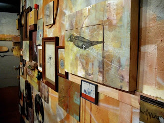
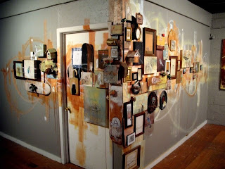
David Hale is an artist that works through many media. He experiments with anything from spray paint on a series of skateboards, tattoo work on people, installations, and painting. I first became familiar with Hale's work at a festival a few summers ago. Overall, his experimentation is a quality I personally find to be innovative and stimulating to look at as well as respect on a developing artist's perspective. In relation to our class, his use of collage is highly stylized and outstanding. The use of collage is an extremely important step in the collaborative stage, and I think, every artist in some sense already does this when brainstorming their concepts and ideas. Doing a literal collage this week for our most recent project helped get my brain going even more so than previous projects. His site is davidhale.org and I highly recommend checking it out!!
Charles Sheeler
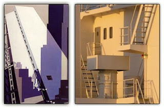 I felt that Michele's post of Charles Dimuth's cubist work really reflects what we are currently doing with the Greenhouses. To expand on what she started, I looked up Charles Sheeler and discovered that he too deals with space in interesting ways. In the piece on the left he creates a complex composition by overlapping and working with transparency. I feel like this is a good tactic in that the space becomes complicated but not overworked. He approaches his work with a very conscious intent; he waters down his compositions by staying within a small range of colors and tones. Sheeler can fill a picture plane, make it abundant with lines and forms, and yet he does it in a way that doesn't overwhelm the viewer. The decisions that Sheeler makes in producing a peice come through in the finished artwork and I think that this is something to pay attention to when creating our own compositions.
texture
Gerhard Richter
Gerhard Richter is a well known painter who does not really have a particular style. He has however, mastered the technique of blurring to create a variety of effects from motion, space, softness, and depth. I was first introduced to Richter in my painting class when we were looking at his blurred portraits and learning his technique of blurring. I looked through his paintings of flowers and landscapes and thought they applied to our drawing class. Even though Richter does not focus on cluttered and complex space, he is able to take a delicate forms like flowers and plants and give them depth, and a three dimensional look to them perfectly. Richter also has many landscape paintings in which he has emphasized the space with atmospheric perspective. By blurring his forms, Richter creates a focused point in which the eye is drawn into and the rest of the space is interpreted as forms in the distance or very close in the foreground. When you draw something from life you tend to draw everything in focus and i think as an artist it is important to be able to see the difference between what your eye can see and focus on and looking at everything as in focus. With the assignment due this week, blurring objects in the distance or giving them a saturated color or lighter lines can give the illusion of space and depth and hopefully can create the same effects Gerhard Richter makes so well.
Tuesday, March 24, 2009
Atelier Bow-wow Company
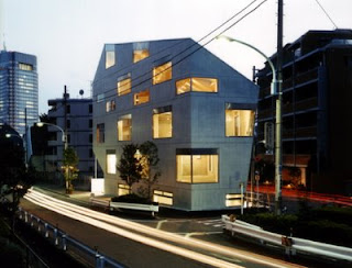
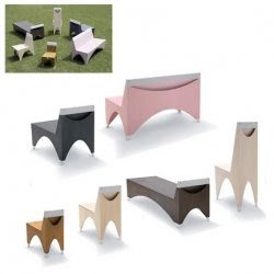
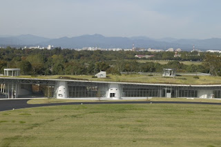
Although this is a company, and not a specific artist, I think that the work done by it is interesting. One of the people from this company came and spoke and I attended the lecture. (Several other people my have also because our Japanese Design professor recommended to go) The work is mainly architectural, which relates back to the basis for several of our drawings in class. The cube, cylindrical, and perspective drawings that we have been doing all can relate to an architectural form. In our past class we were working with organic forms and this company is very in tune with nature. The buildings that they create are all based on observing nature and human behavior and our class is about observing too. The angles being used and the simplicity of form are important to the designers. Their goal is to create a house that is in tune with the way nature works (lighting, wind) along with the way a human behaves in the environment. As far as the chairs go, these were about observing the way dogs behave and then relating it to the form of a chair. I thought this was also relating to our class because our class is about observing something while drawing it. Also, they are about exploring the form of an object and translating it into a piece of art. Overall, I think that the concepts of this company are very interesting and they have a strong.
Sunday, March 22, 2009
Charles Demuth

Charles Demuth was a 20th century artist known for developing a style of painting known as Precisionism, also known as Cubist Realism. The main themes of the style reference the industrial movement, such as machinery, architecture, and industrialization, where all elements are specifically painted to fit into a particular space. Looking beyond what topic the artist is drawing, whether it be exotic flowers in a green house or a row of industrial buildings, the notion of capturing real objects, rearranging and reestablishing spacial grounds is the connection between Charles Demuth and our class assignment. Certain elements are blown up and other elements are shrunken, which produces an interesting composition with a variety of layers and depth.
Michelle,
Do you also know/like the work of Charles Sheeler?
-Robin
Friday, March 20, 2009
Joan Miro Postcard
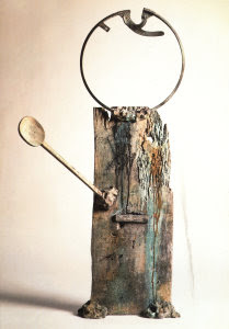
Joan Miro has an interesting way of creating artwork. Instead of actually making the image, Miro uses images from advertisements and other sources. Using conte crayon, these seemingly unrelated pieces are combined together to make an entirely different images. In some cases the new image is an entirely different world. Some of the images look like an animated world with flat blocks of color. Most of Miro's work is abstract. A series of postcards made by Miro back in the 1930s have gone relatively unnoticed in the art world today. Part of this might be due to the fact that the work itself comes from other things. Collage receives criticism at times because it does not necessarily show a something that the artist created. Even though they put pieces together, the source of the images can at times make it seem inferior. However, collage has a major benefit for the entire art world. It give artists the ability to do and see things that otherwise would not have been possible. Its greatest strength is that it opens new doors and windows of understanding. There is no art that is completely original anymore. While this work take more than other work does, it opens new channels of thought and ideas that could significantly advance art.
Ryan,
Have you read any Nicolas Bourriaud? He is a French art theorist and critic. He believes that collage was the precursor to digital media. He relates the pieces combined in collage to the way we think when using digital technologies and digital technologies in the art making process. You may find him interesting.
-Robin
Charles Darwin
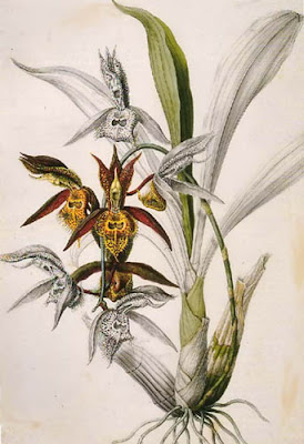
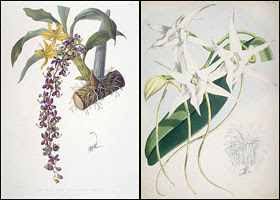
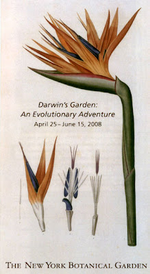
Whenever I think of botanical drawings, I think of Charles Darwin's collection of plants he studied throughout his travels. In organic drawing (especially in figure and botanical drawings), I find that the scientific explanation or unraveling of the object to be extremely useful in its reproduction (my mother wanted me to be a medical illustrator, but I still am unsure of how I feel about an actual cadaver). Charles Darwin, though not a conventionally recognized artist, exemplifies this scientific approach to art. His drawings of the unique flora often include studies of the flower in full rendition or in pieces, revealing the inner workings. He captures the oddities of new plants he encounters. His botanical drawings fearlessly render the unknown, just as we are assigned to explore and create new spaces with organic forms.
Stevie,
Did Darwin draw these? I explored online for the answer. Where these the work of John Bartrum? Do you know John Bartram's work?


Subscribe to:
Comments (Atom)
