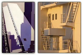
 I felt that Michele's post of Charles Dimuth's cubist work really reflects what we are currently doing with the Greenhouses. To expand on what she started, I looked up Charles Sheeler and discovered that he too deals with space in interesting ways. In the piece on the left he creates a complex composition by overlapping and working with transparency. I feel like this is a good tactic in that the space becomes complicated but not overworked. He approaches his work with a very conscious intent; he waters down his compositions by staying within a small range of colors and tones. Sheeler can fill a picture plane, make it abundant with lines and forms, and yet he does it in a way that doesn't overwhelm the viewer. The decisions that Sheeler makes in producing a peice come through in the finished artwork and I think that this is something to pay attention to when creating our own compositions.
Thursday, March 26, 2009
Charles Sheeler
 I felt that Michele's post of Charles Dimuth's cubist work really reflects what we are currently doing with the Greenhouses. To expand on what she started, I looked up Charles Sheeler and discovered that he too deals with space in interesting ways. In the piece on the left he creates a complex composition by overlapping and working with transparency. I feel like this is a good tactic in that the space becomes complicated but not overworked. He approaches his work with a very conscious intent; he waters down his compositions by staying within a small range of colors and tones. Sheeler can fill a picture plane, make it abundant with lines and forms, and yet he does it in a way that doesn't overwhelm the viewer. The decisions that Sheeler makes in producing a peice come through in the finished artwork and I think that this is something to pay attention to when creating our own compositions.
Subscribe to:
Post Comments (Atom)
No comments:
Post a Comment