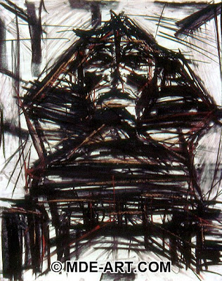
 This is a charcoal drawing done by Michael Edens. He does all different types of drawing and digital work. This is an excellent example of sight lines and mark making. The Sphinx is given through all of the marks. I like how he went back in with the sepia pencil to identify the angular construction of the statue. This is so similar to what we were working on with the toy truck and other drawings in the middle of the semester.
Sunday, April 26, 2009
 This is a charcoal drawing done by Michael Edens. He does all different types of drawing and digital work. This is an excellent example of sight lines and mark making. The Sphinx is given through all of the marks. I like how he went back in with the sepia pencil to identify the angular construction of the statue. This is so similar to what we were working on with the toy truck and other drawings in the middle of the semester.
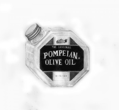 Elle Smith Fagan is a still life artist who primarily works with charcoal and oil paints. She also is a published writer, which I think is important because people tend associate artists with being capable of just making art, so any living counter example is good to know of. This piece is a good example of a high key drawing. It is in an a high key even though it contains dark values out the range. It does a nice job representing a reflective translucent surface and has proper 1 point perspective.
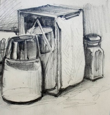 Dave Gurney uses a sketchy style that is similar to how we are taught to mark-make. Leaving in sight lines and varying line quality are things we all have strive to do in our work. I think this diner still life is also applicable because it has two point perspective with cylinders and box, which is what we drew during for our mid-term. Although this is somewhat academic art, I like the composition of the piece because it forces the eye to move back in space and the varying line quality gives the objects character.
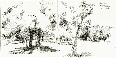 I found this once just surfing the web. I really like it's use of negative space. I like that you can't just see background you have to actually take in all the mark making and then the background emerges. I also like how with just ink stippling the artist somewhat incorporates atmospheric perspective. This piece reminds of our visit to the ESF gardens because it is of plants and the composition is intentionally complex.
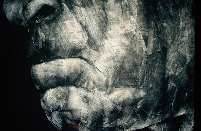 Melanie Baker creates a very interesting texture using the mixed media of charcoal and newspaper. The overlapping of the newspaper creates and abstraction of skin while the chiarascuro charcoal shading gives the overall tone hyper realism. This visual contradiction is incredible to look at. Stylistically, this would be a very unique to do our newspaper portrait homework assignment.
 Linda Plotkin's composition and subject matter is very similar to what we are doing. The main difference is her use of natural lighting and atmospheric perspective out of the window as opposed to our table surfaces and artificial lighting. The subject of her still life is fruit, namely apples and spherical fruit just like us. She also use fabric something we were asked to use inour homework From a tonal standpoint, she uses her composition to identify her light and dark values so that the changes in values make sense. This composition is exactly what we learned about when we drew outside. I think this is a very a successful piece because of the vertical lines and the great representation of translucent fabric.
Friday, April 24, 2009
Mondrian
 Robin, I was introduced to this painting by Mondrian in my arts and ideas class a week or so ago and was reminded a lot of your work. I was wondering if you find inspiration in his tree series; because the composition/subject matter seem to relate. The colors and sense of death and decay in the piece are similar to yours and also, the centralized composition. I think of that really large, sort of graphic piece you did where the branches are tangled almost in a sphere in the center of the canvas. I was just curious to know if you had Mondrian in mind when doing your artwork or if it is a coincidence. If you do find inspiration in his work then I think it's a great example of how the style of a revolutionary artist can be modernized and interpreted.
Woman with hat, Matisse

 I've been wanting to post this for a while and even though we already did the collage, I feel like it is still relevant. In the above painting, Matisse used an array of unrealistic colors to depict the woman wearing a hat. While the color palette seems to be random and playful, Matisse is actually exercising tonal elements. When the color image is shown in black and white the values in the painting still remain crisp and clear. This painting is an example of how color reflects and absorbs light which is important to understand when drawing in a gray value scale. Although the "color" of an object may be black it won't necessarily embody the "shade" black and Matisse points out that this is an important factor that artists need to be aware of. In doing our collages and translating color to shade the realization needed to be made that something bright red would appear darker than a deep or dull green. Even when drawing and shading from life, color is translated into value/tone by examining the way light plays off of a surface.
Thursday, April 23, 2009
Printmaking

I found this self portrait in the Washington Post online. It first stood out to me because of the contrast and divide between the blacks and white and the positive and negative space. I like how there are no grays and only blacks and whites. I also really like how it makes the viewer unsure as to what is the positive space or what is the negative space. I also really like the line quality and the really thick lines. the lines in the face really stand out to me. The second reason why this drawing stood out to me is because it was done by an 8th grader. After making my first drawing in the printmaking studio last week, I am very impressed by this 8th grader.
Wednesday, April 22, 2009
MC Escher
 This is a drawing by MC Escher. It has a good range of value, and a lot of midtones which is pretty nice. the background is completely flat and shows no space but the spheres reflection includes great depth. The hand is very realistic and so is the reflection but there is some texture that makes it look a little grainy. There is a balance throughout the piece like the dark background and the dark tones in the shelves with the contrasting lighter toned hand and ceiling.
W.C. Andrews
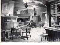
I really like W.C Andrews. I have never heard of him before this, but he has a very rich history. He use to own an Interior decorating business and started his film career. You can see the influence he takes when drawing this from his interior's business. He uses great tonal contrasts. It is also a planar design in which he utilizes radiating lines.
Stanley Donwood
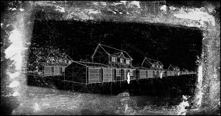
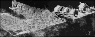
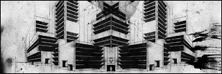 Stanley Donwood is the artist for some of Radiohead's album covers. I first heard of this artist from those works. Exploring his personal endeavors, on his website slowlydownward.com, he has a variety of poetry and artworks. He uses two point perspective in complex ways as well as a variety of mediums to illustrate a narrative between his deeper, darker poetry and his visual works. The use of the grayscale holds to be interesting, in that it sets a mood or tone to the overall theme. Some of his work, uses linear lines to establish a sense of multiple dimensions and a sort of illusion. In relation to the class, the use of perspective, grayscale, and mixed media (ex. newsprint) are all areas we have been exploring.
Thursday, April 16, 2009
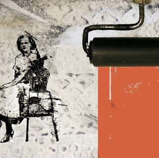 I found this image on the Nelson Mandela Metropolitan University website in a section discussing the career options for printmaking. I find this piece particularly interesting because I have some experience with the medium after todays class. I think that is always the most important thing. It is so easy to go to a museum today and see some great work and see some work that does not look so great. I know I used to think that about clay sculpture. After trying the medium myself, I discovered just how difficult it truly is. The same principle applies to todays class. Not that i know a little about printmaking it makes a big difference in the way i view a piece. I understand the difficulties more now. I would like to learn more about the wood block prints. I think it would be extremely interesting and exciting to make make prints like that. I really like what our instructor said about printmaking. He said it is kind of a cross roads of many different majors. I think that is particularly true in this case. Almost all art has the same fundamental principles but printmaking really is a good cross roads for drawing, illustration, painting, photography and almost any kind of two dimensional imagery. It is an interesting medium because there is no easy way to make the grays. It is not to difficult to make black or white. But the ways to make grey are as diverse as the number of people that try it. The medium itself is extremely experimental. It is really just about trying different things and seeing what works and what doesn't.
Wednesday, April 15, 2009
Kate Ward Terry
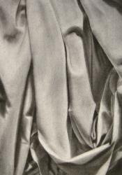
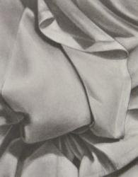
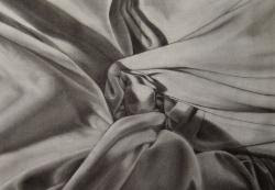
I was looking up charcoal drawings and discovered this artist, Kate Ward Terry. I thought that her work was very similar to that of our drawing class, especially because our last drawing had a requirement of incorporating fabric. She uses tone in a rich manner by utilizing the darkest darks and whitest whites selectively and carefully. Each one of these drawings are of the same object, fabric, however the folds make each piece interesting and original. I am intrigued by how the cloth takes on movement and organic form. the variation in tonality created movement around the page and the folds create depth and interest. The areas where the cloth is less folded creates an area of rest for the eye and the crinkled areas create focal points along with texture. The way that she used the charcoal was very smooth and blended, yet she did not loose any of her value tones and managed to create a realistic image.
Tuesday, April 14, 2009
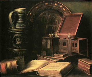
Charles A. Meurer

Monday, April 13, 2009

 These are both sketches by Edward Hopper. I really like both of these a lot because of the mark making. Some of it is really loose and other parts are more tight but still keep its integrity of light and dark. I like how you can still see where the light is coming from and how intense it is when all the drawing is is a bunch of lines. There is a nice variety of line thickness as well: from the thick scribbles to the fine grass and house lines. There is also nice perspective in the drawings as well.
Chuck Close

Chuck Close's over sized self portraits are a study of value and scale organized in an interesting composition. This concept relates to our drawing classes study of tone and grey scale for many reasons. In our collage assignment, we are responsible for analyzing specific tones in a picture of our faces. From this analysis, we are to match appropriate levels of grey from newspapers to the image with respect to the varieties of tone. Up close, the collage should look like a jumble of newsprint, but far away should create a photographic finish. In our other assignment, the oversized portrait of our face in a photocopier, we have to recopy our photocopied scan on a piece of oversized paper, making sure we match the appropriate grey scale. Even though Chuck Close works with color the idea of enlarging the scale of a face and matching the appropriate tones to create a realistic finish is basically the same concept we must practice in class.
Friday, April 10, 2009
David Choe

David Choe is a very accomplished artist who works in a variety of media. He works with oil paints, acrylic, drawings, sculptures, walls, photography, and watercolor. His attention to detail is really uncanny. He is above all my favorite artists. A favorite subject matter of mine to draw is facial expression and he really captures the variety of human form and emotion in all of his pieces. I really feel his oil and acrylic paintings are the most powerful, but since this is a drawing class, I chose to display this drawing of his. The use of value is not the most broad, but his mark-making really makes each character in his pieces unique in their own way. I feel as if every piece has its own story and/or character behind it.
Thursday, April 9, 2009
High Key
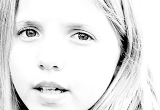 This is a photograph by Isabel Silva from www.pbase.com. It is not a perfect example of high key because there are some blacks in the piece. However, it is a good example of the basic principles. The entire face almost seems kind of flat because there is no change in value. As a result, the face itself is not what the viewer really looks at. Instead, the eyes and mouth bring the viewer in and become the major focal points of the piece. When I was searching for an example of a high key piece, I came across many photographs. The idea does not seem to be as common among artists that draw or paint. However there are many different websites that either show high key photos or even tell you how to make one yourself. In all the examples I came across the eyes became the focal point. Because of there low value the eye are usually the center of attention in many portraits. However this feature is even more prominent in high key work and the eyes become especially piercing.
Wednesday, April 8, 2009
Richard Talbot
Tuesday, April 7, 2009
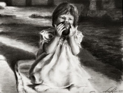 This is the Apple Drawing by Jes Ewers. I had seen it a while back but recently realized that it is very similar to the work we are doing in class. It is done entirely in charcoal and although we really haven't drawn people, we have started tone and value of fruit. As well as drawings in outdoor settings. Moreover, our most recent assignment involves drawing fabric. Most importantly, I think Ewers does an excellent job of tonal composition, a topic we discussed in class. The piece is balanced and tonally comprehensible because you see where the high key and low key sections of the piece are. This organization gives the viewer a clear understanding of foreground and background relationship. I think composition would be boring if it were shaded any other way.
Sunday, April 5, 2009


These drawings were made my Georges Seurat with conte crayon on paper. I thought both of these drawings demonstrated very well what we are learning in class about value and tone, and even mark making. The first one definitely shows where the light is coming from and how bright the light is, almost engulfing the figure in its atmosphere. His style is very soft and almost abstract. He used the process of layering and erasing the conte to create his marks and allow the papers texture to come through and be part of the drawings. Both of the drawings are very still and peaceful. I think the bottom one is more dark and isolated and that goes very well with the lack of variation of value. The dark values are very similar but still stand out in a very subtle and delicate way. I like both of these drawings a lot and i think his technique can be applied to any form, from fruits to figures, and with medium from charcoal to pencil.
Thursday, April 2, 2009
Low Key
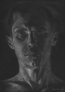 I had a lot of trouble finding any work that was either low or high key. For the most part is seems like artists use both high and low key sections in there drawings. It is like they divide the composition into shapes and each shape is either high or low key. I came across this drawing credited to rubenart on artition.com. It is a really great example of a low key drawing. The lightest areas are in the neck but are still relatively dark. In some ways they could be slightly darker. Compositionally the piece is balance but I think an unbalanced piece could also work really well in this case. There is no real subject ground relationship established. The background seems to just be black but it is almost a hazy black in some areas. It was a good choice because it allows the artist to show where the head ends and the background begins. If the head just blended into the background it would just flatten the entire piece out. I think one of the greatest strengths that the artist has is not outlining. He matches the tones well create an extremely realistic piece. Another great thing about the composition is that it has a lot of potential. There are so many things that could be done with this piece. The tones could be altered to make one half high key and the other half low key. Or the subject could shift slightly. The blank stare is almost haunting and depressing.
Wednesday, April 1, 2009
My friend's work
Chuck Close
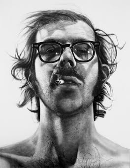
Since we are working with values and shading, I just had to post one of Chuck Close's pieces. In my opinion he is a master at shading because he really studies where exactly the light is hitting his subject and exactly how much. He uses shading well to show texture, as in his hair and mustache. He also used a really white white in his glasses to show their shine. Now I'm sure most of you have seen his work, but I recently started looking at it again since our last class and I think it will help me a lot with shading.
newspaper collage
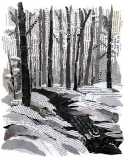 I came across this image on www.pbase.com. The work was credited to "Aunt Cathy." I think this is a really good example of the type of work we are doing right now on the self portrait newspaper collage. It is interesting to me that pictures can be represented in a very simple manner. In this case the picture is only based upon the form of each piece and the value. These two thing, although somewhat simple in concept, make a really great picture. Even though the concept is somewhat simple the procedure is not. It takes a lot of work. This type of work requires attention to detail. It is also really important to have a large range of values. The larger the range, the more three dimensional the image will look and consequently the more realistic. I especially like using newspaper for collage. You never really know exactly how it is going to turn out. Some times the words on the paper can really add a lot to the picture. I really like how the artist altered the direction of the words in the snow. It gives each piece a different direction of motion. However, the trees are all oriented vertical. This is a simple strategy that can be easily overlooked but it adds so much to the overall picture.


