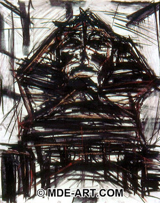
 This is a charcoal drawing done by Michael Edens. He does all different types of drawing and digital work. This is an excellent example of sight lines and mark making. The Sphinx is given through all of the marks. I like how he went back in with the sepia pencil to identify the angular construction of the statue. This is so similar to what we were working on with the toy truck and other drawings in the middle of the semester.
Sunday, April 26, 2009
 This is a charcoal drawing done by Michael Edens. He does all different types of drawing and digital work. This is an excellent example of sight lines and mark making. The Sphinx is given through all of the marks. I like how he went back in with the sepia pencil to identify the angular construction of the statue. This is so similar to what we were working on with the toy truck and other drawings in the middle of the semester.
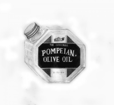 Elle Smith Fagan is a still life artist who primarily works with charcoal and oil paints. She also is a published writer, which I think is important because people tend associate artists with being capable of just making art, so any living counter example is good to know of. This piece is a good example of a high key drawing. It is in an a high key even though it contains dark values out the range. It does a nice job representing a reflective translucent surface and has proper 1 point perspective.
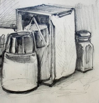 Dave Gurney uses a sketchy style that is similar to how we are taught to mark-make. Leaving in sight lines and varying line quality are things we all have strive to do in our work. I think this diner still life is also applicable because it has two point perspective with cylinders and box, which is what we drew during for our mid-term. Although this is somewhat academic art, I like the composition of the piece because it forces the eye to move back in space and the varying line quality gives the objects character.
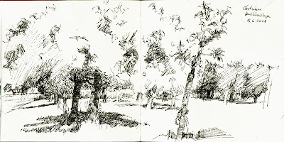 I found this once just surfing the web. I really like it's use of negative space. I like that you can't just see background you have to actually take in all the mark making and then the background emerges. I also like how with just ink stippling the artist somewhat incorporates atmospheric perspective. This piece reminds of our visit to the ESF gardens because it is of plants and the composition is intentionally complex.
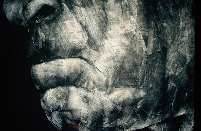 Melanie Baker creates a very interesting texture using the mixed media of charcoal and newspaper. The overlapping of the newspaper creates and abstraction of skin while the chiarascuro charcoal shading gives the overall tone hyper realism. This visual contradiction is incredible to look at. Stylistically, this would be a very unique to do our newspaper portrait homework assignment.
Subscribe to:
Comments (Atom)

